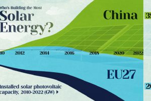
China’s solar capacity triples USA, nearly doubles EU. Read more
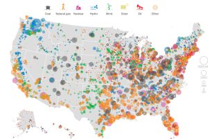
This series of data visualizations shows how the United States has generated its electricity so far in 2015 by energy source and size of each power plant. Read more
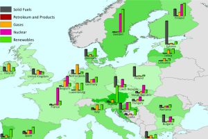
This series of charts and maps show an overview of Europe’s energy consumption, as well as consumption (per capita) by country and source. Read more
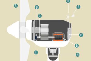
How does the modern wind turbine generate electricity? This animation breaks down the parts of a turbine, and how they all work together to make green energy. Read more

Which new sources of energy have promise? This infographic highlights the upcoming technologies that may provide the alternative energy sources of the future. Read more
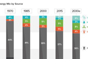
See how America’s energy mix has evolved from 1970 until today, as well as a projection for the energy sources to be used in the year 2030. Read more
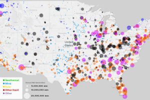
What sources of power are closest to you, and how has this mix changed over the last 10 years? See every power plant in the U.S. on this handy map. Read more
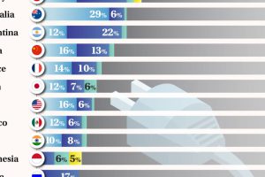
Brazil leads the G20 in renewable electricity. Read more
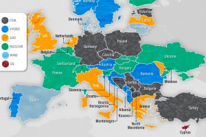
As Europe and the EU shift away from fossil fuels, which energy sources are European countries depending on for their electricity generation? Read more


