

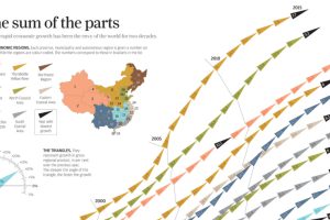
China’s economic miracle over the last 20 years is the sum of its parts, with each region of the country contributing to growth in different ways. Read more
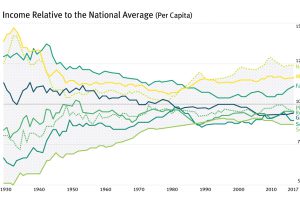
For most of the century, the geographical difference in per capita incomes has been narrowing – but it appears this trend has now reversed in the U.S. Read more
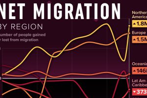
We visualized net migration statistics from the United Nations to gain insight into the flow of people globally. Read more
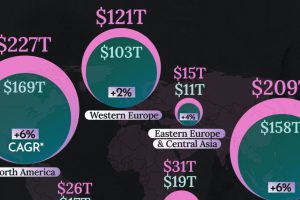
This graphic shows the latest forecasts for net wealth by region, highlighting the dominance of three key regions. Read more
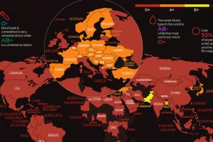
There are 8 common blood groups but 36 human blood types in total. Here we map the most widespread blood types in every country in the world. Read more
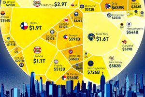
How does each state contribute to America’s overall GDP? This visualization breaks down the U.S. economy by state. Read more