

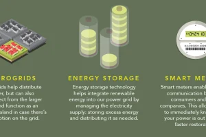
How does electricity to your home? This infographic shows how the power grid works, along with the brand new innovations coming to a grid near you. Read more
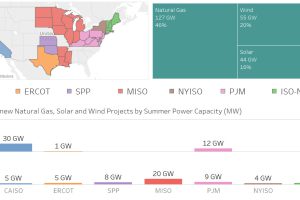
Nearly 100 GW of new power coming online is from solar and wind, making up 36% of new electrical capacity being added in these jurisdictions. Read more
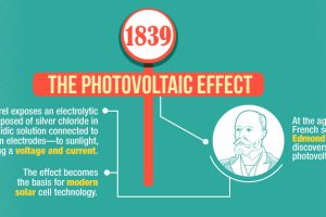
This infographic shows the many technological advances made throughout the history of solar energy – going all the way back to the Neolithic Era in China. Read more
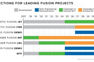
Fusion is the epitome of ‘high risk, high reward’ research. Each new technological breakthrough brings us a step closer to power that’s too cheap to meter. Read more
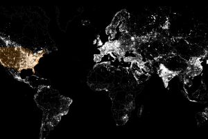
These satellite maps visualize where different energy sources, like fossil fuels, nuclear, or renewables, are used to generate electricity. Read more
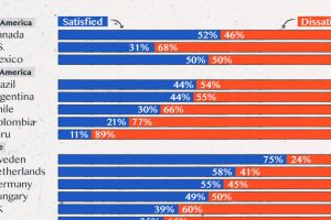
Satisfaction with democracy has declined in recent years, particularly in high-income nations. Read more
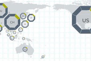
This interactive map uses 114 metrics to measure the geopolitical power and influence of 25 countries, focusing on Asian powers and the United States. Read more
Charting the most influential countries in Asia, plus a look at the countries that punch above their weight class, in terms of power and influence. Read more
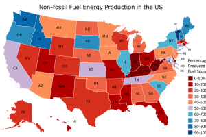
In countries where energy is plentiful, we often take the grid for granted. But do you know where your power comes from, and how green it is? Read more

We round up the most popular, most discussed, and most liked visualizations of the month on Voronoi, our new data storytelling platform. Read more