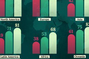
This map shows life expectancy at birth for key global regions, from 1950 to 2050F. Read more

Eight men have the same wealth as the poorest 50% – we use the Oxfam report as a springboard to dive into a discussion on inequality, philanthropy, and poverty. Read more
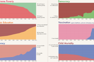
Long-term trends really allow you to see human progress on the most important indicators, like poverty reduction, education, democracy, literacy, and health. Read more
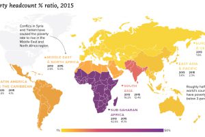
We look at the latest data from the World Bank, which reveals a drop in extreme poverty of 1 billion people globally since the year 1990. Read more
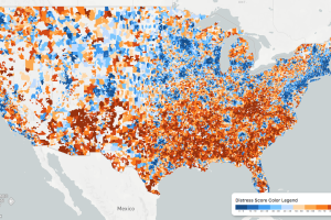
While the U.S. economic picture remains quite rosy, things change quickly when you zoom to the local level. This map shows the country’s distressed communities. Read more
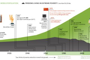
This interactive graphic shows the poverty rate of every state, and also how poverty levels have changed over time according to the U.S. Census Bureau. Read more
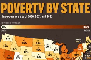
U.S. poverty rates were relatively higher in the South, compared to northern states. Which states saw the highest rates in 2022? Read more
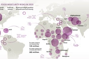
Over 135 million people face acute food insecurity worldwide—but COVID-19 could almost double these numbers. Which regions could be most affected? Read more
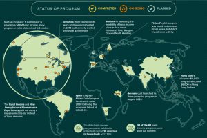
Amid the pandemic, the idea of Universal Basic Income has been gaining steam with policymakers. Where has it been tried, and has it worked? Read more
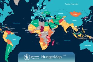
Every day, hunger affects more than 700 million people. This live map from the UN highlights where hunger is hitting hardest around the world. Read more

