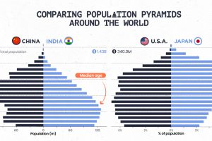
Population pyramids can show a country’s demographic advantages and challenges at a glance. See how different parts of the world stack up. Read more
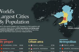
This graphic uses data taken from latest official censuses and projections to rank the largest cities by population. Read more
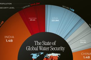
This chart highlights the different countries, and the number of people, facing water security issues around the world. Read more
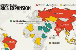
We provide a data-driven overview of how the recent BRICS expansion will grow the group’s influence and reach. Read more
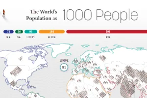
How would all the people in the world be spread out if there were only 1,000 people on Earth? This interactive map examines the breakdown. Read more
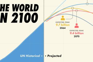
Population projections from the UN suggest that there will be over 10 billion people by 2060, though other organizations disagree. Read more

From someone born in the 19th century, in the midst of historic population growth, comes this vintage visualization showing world cities growing ever bigger. Read more

To offer perspective on the population of U.S. states, this map compares them to countries that share similar population sizes. Read more
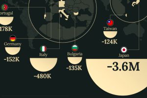
Despite the consumer class growing worldwide, some countries are predicted to see a decline in the number of consumers over the next decade. Read more
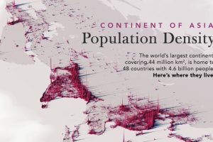
We visualize Asia’s population patterns to see where 4.6 billion people, or two-thirds of the world’s population, actually live. Read more

