


We round up the most popular, most discussed, and most liked visualizations of the month on Voronoi, our new data storytelling platform. Read more

The U.S. saw 7.4% population growth in the past decade, the lowest it’s been since the 1930s. How does population by state look today? Read more
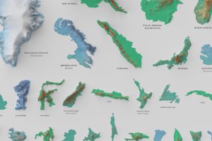
See the world’s 100 biggest islands in a side-by-side comparison. Then, we look to see which islands have the highest population densities. Read more
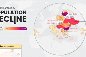
Population decline is a rising issue for many countries in Eastern Europe, as well as outliers like Japan and Cuba. Read more

Our population will soon reach a new milestone—8 billion. These visualizations show where all those people are distributed around the world Read more
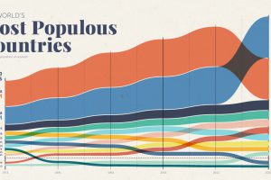
Over the past 50 years, the world’s population has doubled, and there have been big changes in the ranking of the world’s most populous countries Read more
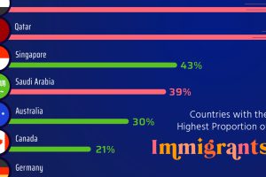
Here, we highlight countries that are magnets for immigration, such as UAE and Qatar, as well as nations with very few foreign born residents. Read more
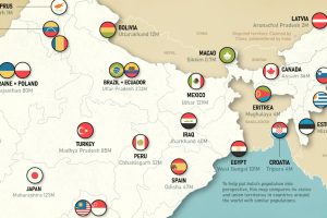
This map juxtaposes nations and Indian states to provide a new perspective on the world’s soon-to-be most populous country Read more
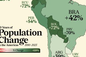
Nearly every country in the Americas has seen a population boom in the last three decades. Some have doubled in size. Read more

In this graphic we explore the world’s declining fertility rate over the last 60 years and the disparity in fertility rates between nations Read more