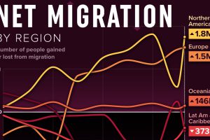
We visualized net migration statistics from the United Nations to gain insight into the flow of people globally. Read more
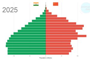
The world’s two most populous countries have some economic similarities, but China and India are also diverging in one key area: demographics. Read more

Rural counties across the U.S. are losing residents as large cities and the coasts are growing. This map shows U.S. population change by county. Read more
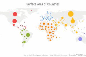
We’ve come a long way since Pangea. This short video examines the area, population, and GDP of our continents as a share of the world’s total. Read more
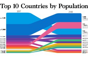
New estimates show that world population may begin shrinking in coming years. We visualize this and how country populations will change by 2100. Read more
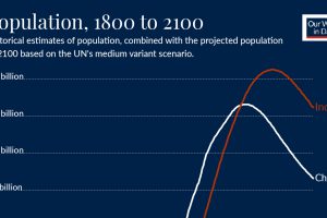
When will India’s population overtake China’s? Take a look at the trends behind this impending demographic milestone. Read more
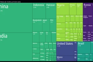
The most populous countries in the world are China, India, and the U.S—but global population trends may be shifting faster than you think. Read more
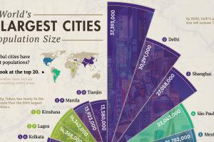
Where are the world’s largest cities in terms of population? This graphic looks at the top 20 most populous cities in the world. Read more

About 80% of the U.S. lives in cities. That’s 264 million people. But how does it vary per state? We investigate. Read more

Toronto was the fastest-growing city in Canada and the U.S. in 2023, adding over 125,000 people to its population. Read more

