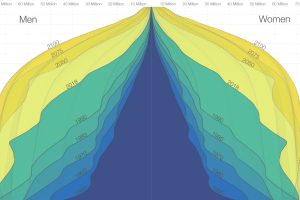
The world is in the midst of a notable demographic transition. Here’s how the world population pyramid will change as we close in on the year 2100. Read more
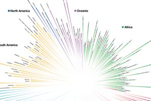
How do countries around the world compare in terms of age? This compelling visualization shows the median age for every country in the world. Read more
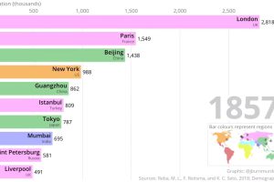
This two-minute animation shows changes in the last 500 years of historical rankings for the world’s 10 most populous cities. Read more
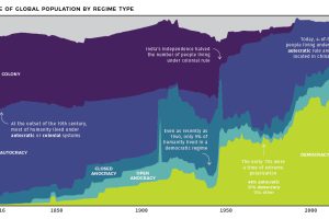
At the start of the 19th century, less than 1% of humanity lived under democratic rule. See how systems of government have changed over the last 200 years. Read more
Global fertility has almost halved in the past century. Which countries are most resilient, and which have experienced the most dramatic changes over time? Read more

This infographic explores how China’s proposed social credit system will monitor and surveil citizens, and how it’ll be used to reward or punish them. Read more
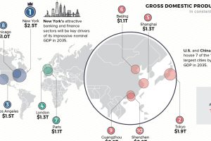
Cities are heavy hitters in the global economy. Where will the top 10 cities be in 2035—based on GDP, population, and annual growth? Read more

More people doesn’t automatically equate to more Olympic medals, as some of the world’s most populous countries have found out over the years. Read more
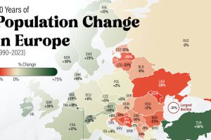
There’s an east-west divide when it comes to Europe’s population growth in the last 30 years. And it’s very apparent in this map. Read more


