


With every country’s growth visualized on a logarithmic scale, we look at a few world population growth outliers and their unique stories. Read more
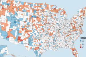
Which counties have the youngest populations, and which are meccas for aging retirees? This map shows the median age of every county in the United States. Read more
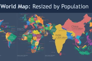
Look at global population in a whole new light, when countries on the world map are drawn based on population numbers instead of their usual borders. Read more
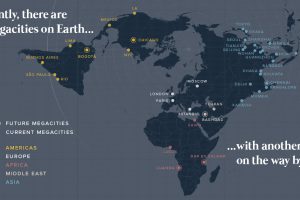
There are currently 33 megacities in the world with over 10 million inhabitants – but by 2030, there will be six new megacities, including one in the U.S. Read more

These maps of North America and Europe use a deceivingly simple method to plot population density: replacing each town with a single dot. Read more
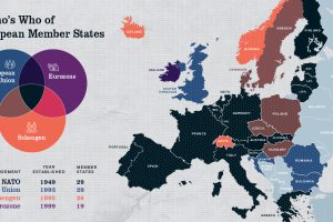
Europe has members in at least four major treaty groups. This map shows how these groups fit into the big picture of Europe’s member states. Read more
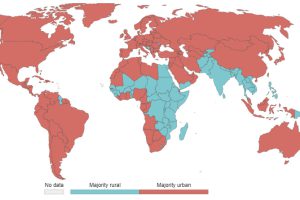
55% of the world lives in urban areas today. But what defines an urban population, and how will this big picture change by 2050? Read more
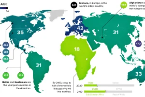
This chart takes a look at the median age of every continent, while also breaking down the youngest and oldest countries in the world. Read more
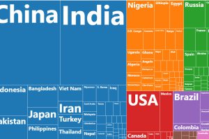
This chart resizes the world’s countries based on population, while organizing them based on region. See where all 7.5 billion people live. Read more
This simple map visualization will change how you think about global population, and how people are distributed throughout the planet. Read more