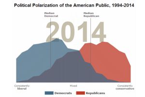
A recent study by the Pew Research Center shows that the polarization of politics in America is greater than ever before. Looking at the current presidential field only confirms this. Read more

Election day is finally here. Here’s 10 charts and maps that will be central to the story as America makes its historical decision. Read more
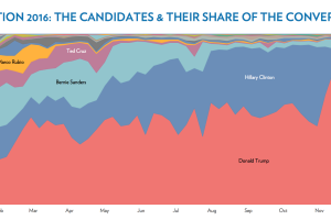
An in-depth analysis of over 2 billion tweets shows who and what dominated the news cycle of 2016 in the United States. Read more
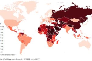
A recent report from a watchdog says that freedom has fallen globally for 11 years – and that this decline of freedom has accelerated in recent years. Read more

The field has been narrowed for the French election, and now just Macron and Le Pen remain. See how they compare head-to-head in this infographic. Read more
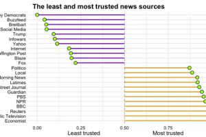
Which news sources do Americans trust, and which outlets do they consider to be full of it? See the results from this survey of >8,000 Americans. Read more
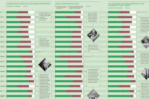
Is globalization a force for good or bad? The answer to this question depends greatly on who you ask – here is a survey of people in 19 countries. Read more
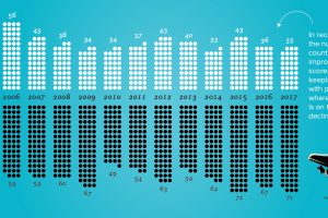
The decline of freedom has been accelerating around the world. This chart visualizes the context, data, and key countries where freedom is falling. Read more
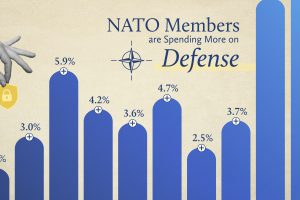
NATO members have significantly increased their defense spending over the past two years. Read more
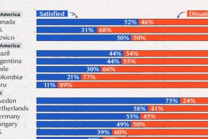
Satisfaction with democracy has declined in recent years, particularly in high-income nations. Read more

