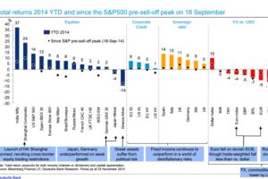
This Deutsche Bank chart shows the performance of every major asset class YTD so far in 2014. Read more
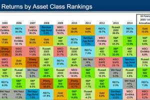
Chart showing historical returns by asset class from 2004-2014. How do investments in bonds, equities, real estate, gold, and commodities compare over time? Read more
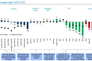
With August’s meltdown, most assets have had a rough year. This snapshot from Deutsche Bank shows YTD performance, and one market that has bucked the trend. Read more
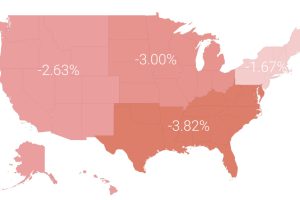
In a volatile market in 2015, the average investor lost 3.1%. In today’s post, we break this performance down by region, profession, and age. Read more
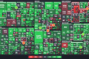
The U.S. market is up 9.5% so far in 2017, but individual sectors are all over the place. We look at four of the best – and four that have… Read more

