

Every country is represented in this deceptively simple visualization. We then show all U.S. counties using a similar method, which might make you feel small! Read more
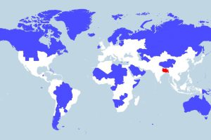
More people live in the tiny red region than all of the blue areas combined. This map really shows the disparity in population density throughout the globe. Read more
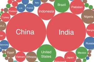
How many ultra rich people live in each country and continent? This chart shows the amount of people with fortunes exceeding $500 million in each place. Read more

Here are 11 common phrases that managers should avoid saying to their teams, and what they should replace them with to get a better result. Read more
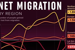
We visualized net migration statistics from the United Nations to gain insight into the flow of people globally. Read more

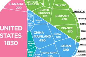
To offer perspective on the population of U.S. states, this map compares them to countries that share similar population sizes. Read more
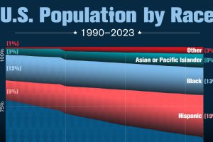
The nation’s non-white population has nearly doubled since 1990. Read more