

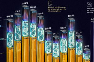
Governments pour nearly $500 billion into fossil fuel subsidies annually. This chart breaks down fossil fuel subsidies between 2010 and 2021. Read more
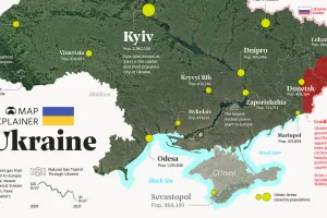
Ukraine has made the headlines due to the ongoing tensions with Russia. In this map infographic, we examine Ukraine from a structural point of view. Read more
The current energy transition is unprecedented in both scale and speed. This infographic puts it into historical context. Read more
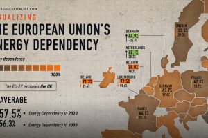
The EU’s energy dependency has become a major issue amid Russia’s invasion of Ukraine. See what the data says in this infographic. Read more
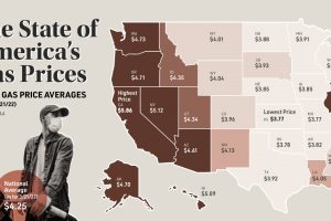
This map looks at gas prices across various states, and historical context for today’s sky-high prices at the pump. Read more
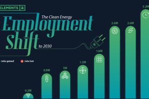
Will the clean energy transition create jobs, or will jobs be lost? Here is projected employment growth in clean energy and related sectors to 2030. Read more
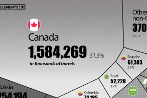
This visualization breaks down U.S. oil imports by country for 2021, showing the split by OPEC and non-OPEC nations. Read more
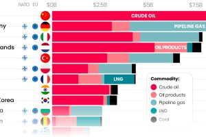
Here are the top importers of Russian fossil fuels since the start of the war. Read more
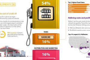
Gasoline prices across the U.S. have reached record-highs. Why? This graphic helps explain what factors influence the cost of gasoline. Read more
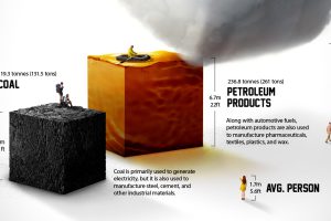
Each year the average American consumes more than 23 barrels of petroleum products. What does a lifetime of fossil fuel consumption look like? Read more