

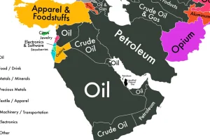
If we could only show you one map to explain the economy of the Middle East, it would be this one. Read more
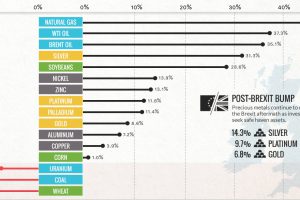
Commodities are back! Precious metals hit two-year highs post-Brexit, while oil and natural gas had their best quarter in years. Read more
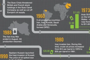
Oil is the world’s most traded commodity and a staple for investors – this infographic shows the volatile history of crude oil markets. Read more
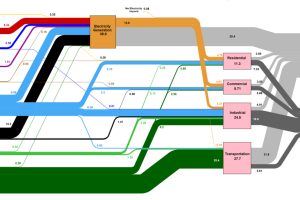
This massive diagram shows all energy created in the U.S., and where it goes. It’s not sexy, but it gives a great 10,000 ft overview of energy consumption. Read more
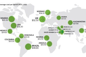
It’s been two years since the oil price crash. This chart looks at three sets of oil data, while we check in on the economies most ravaged by low oil… Read more
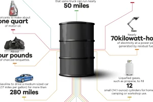
You may think of oil as the gooey black stuff used to make gasoline. However, it has thousands of applications – here’s what comes from one barrel of oil. Read more
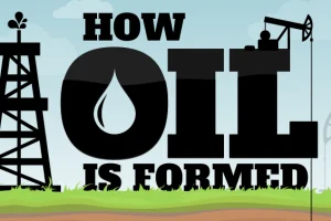
This infographic shows how oil is formed, along with some history, uses, and types of oil found. It also presents a lesser-known theory on how oil forms. Read more
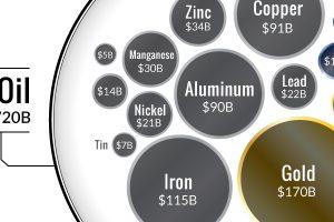
Ever wonder why the oil industry has so much influence? This chart shows that all metal markets combined don’t even come close to touching the oil market! Read more
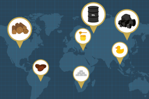
Every “thing” comes from somewhere. Whether we are talking about an iPhone or a battery, even the most complex technological device is made up of the raw materials that originate… Read more
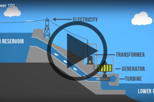
Want to learn about how different energy sources work? Check out these short, fact-driven videos on topics like oil, hydro, solar, wind, LNG, or fracking. Read more