This infographic video shows the story behind oil’s plunge through 2014. Read more

Saudi Aramco, the Saudi Arabian oil and gas giant, is by far the biggest energy company in the world, generating $1 billion in revenue per day. Read more

In this Powering New York slideshow, we visualize what it takes to power NYC with every type of energy including gas, wind, solar, nuclear, and more. Read more

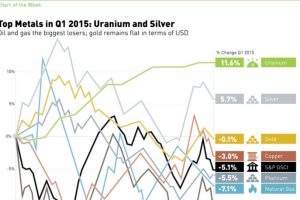
In 2015 Q1, silver and uranium led the way, while oil and natural gas struggled. See all returns in today’s Chart of the Week. Read more

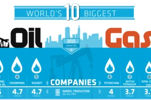
Ranking the world’s 10 biggest oil and gas companies by oil production per day, country, and production growth over the last decade. Read more

This series of data visualizations shows how the United States has generated its electricity so far in 2015 by energy source and size of each power plant. Read more

The People’s Bank of China shook markets this week with three separate yuan devaluations. Here’s the aftermath of these moves in currencies and commodities. Read more

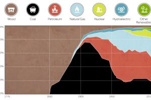
This chart shows the history of America’s energy supply based on energy source. This brief history covers all from wood-powered locomotives to solar panels. Read more

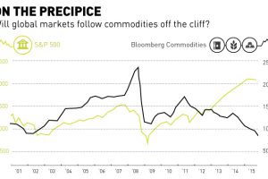
Commodities have fell off the cliff with oil and base metals getting crushed over the last year. Is the general market about to follow the same trend? Read more

Compare the United States, China, and Canada side-by-side to see the differences in how these energy titans consume, produce, and import/export energy. Read more

