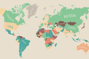
60,000 people in 180 different countries were asked by the OECD Better Life Index what was most important to them, and the data is presented in this infographic. Read more
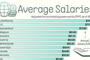
See how average annual salaries vary across 30 different countries, adjusted for purchasing power parity (PPP). Read more
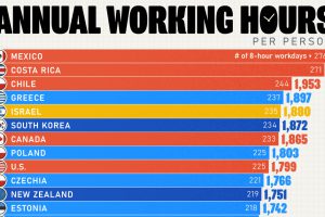
We rank OECD countries by their average working hours per year, revealing some interesting regional trends. Read more
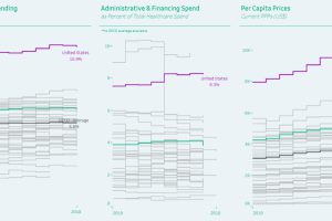
Healthcare spending can be measured as a proportion of GDP, by admin costs, and per capita—and the United States comes in first in every category. Read more

We round up the most popular, most discussed, and most liked visualizations of the month on Voronoi, our new data storytelling platform. Read more
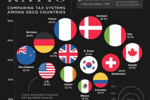
Using the tax-to-GDP ratio, we compare the tax systems of 35 OECD countries. See which nations have the highest and lowest rates. Read more
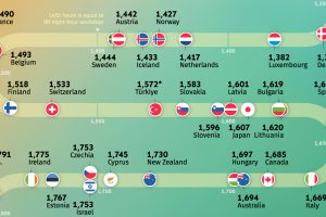
Where do people work the most? Explore our analysis of the average annual working hours across OECD countries. Read more
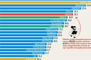
Nearly three years after COVID-19 first hit, youth unemployment in some countries, like China, has risen sharply. Read more
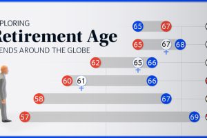
We chart current and effective retirement ages for 45 countries, revealing some stark regional differences. Read more
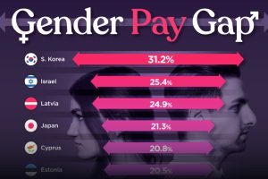
Which OECD countries have the largest gender pay gaps? We look at the 10 countries with gaps higher than the average. Read more

