


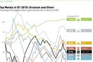
In 2015 Q1, silver and uranium led the way, while oil and natural gas struggled. See all returns in today’s Chart of the Week. Read more
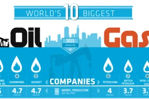
Ranking the world’s 10 biggest oil and gas companies by oil production per day, country, and production growth over the last decade. Read more

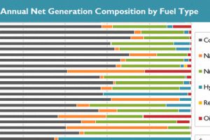
This series of data visualizations shows how the United States has generated its electricity so far in 2015 by energy source and size of each power plant. Read more
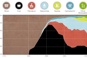
This chart shows the history of America’s energy supply based on energy source. This brief history covers all from wood-powered locomotives to solar panels. Read more
See in this .gif animation how much the U.S. electricity grid has evolved over the last two decades. Read more
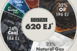
This graphic shows the sources of energy used globally in 2023, measured in exajoules, with fossil fuels making up 81% of the energy mix. Read more

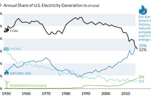
The decline of coal has been swift and unprecedented. We show in these three charts how it went from American energy hero to zero. Read more
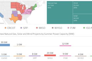
Nearly 100 GW of new power coming online is from solar and wind, making up 36% of new electrical capacity being added in these jurisdictions. Read more