


See how financially literate you are by answering this very short quiz. Can you get more than two questions right? (If so, you beat the average American) Read more
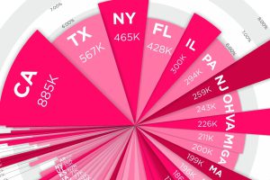
Where do millionaires live in the country? See millionaires by state – in terms of absolute numbers and percentage concentration – in this compelling visual. Read more
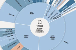
This nifty visualization from Knight Frank breaks down the world’s population of ultra-wealthy ($50mm+) people by country and region. Read more
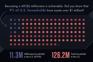
Millionaires are more common than you may think – here are the steps you need to take with your retirement investments to become a 401(k) millionaire. Read more
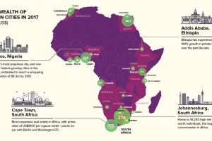
Private wealth in Africa is set to grow $800 billion in the next decade. Here are the continent’s 23 richest cities mapped, along with other key facts. Read more
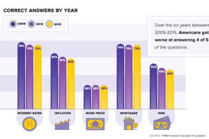
Financial literacy has been dropping for years in the United States – and with student debt at all-time highs, how do we put our students in a spot to succeed? Read more
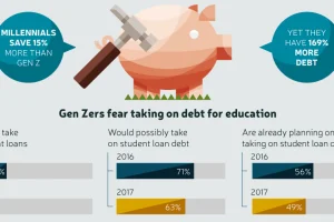
Gen Z saw their older friends take on massive amounts of debt, while struggling to secure stable jobs – and now they are learning from those mistakes. Read more
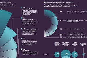
This infographic provides a glimpse into the world of regtech, a booming tech sector that’s helping financial firms to comply with onerous regulations. Read more
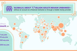
Since the invention of banking, the global financial system has increasingly become more centralized. Here are the big flaws it has, as a result. Read more
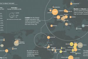
What cities are the world’s ultra-rich flocking to? This map looks at ultra high net worth individual (UHNWI) growth rates in cities around the world. Read more