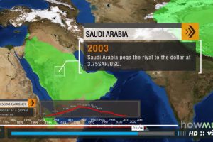
The U.S. dollar is the dominant reserve currency, making up 64% of global reserves. How did this come to be, and what does the future hold for the dollar? Read more
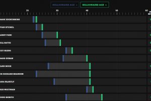
Is it the first million or billion that is the hardest? See how long it took these entrepreneurs to go from millionaire to billionaire. Read more
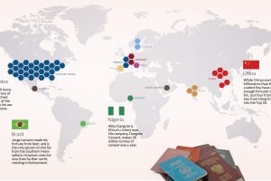
This stunning data visualization breaks down the top 50 wealthiest billionaires by industry, age, country, as well as the size of their fortunes. Read more
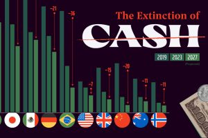
As credit cards and digital wallets increase in popularity, the world is seeing the death of cash as means of transaction. Read more
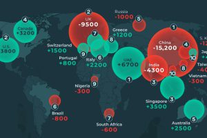
This graphic shows the countries expected to see the highest millionaire migration in 2024, both in terms of net inflows and net outflows. Read more

This graphic illustrates the distribution of wealth in the United States from 1990 to 2023 by generation, from Millennials to Boomers. Read more
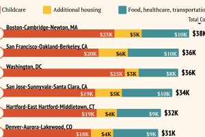
Raising a child in a large U.S. metro costs an average of $25k per year. Read more

The U.S. has more millionaires than Ireland has people. Here’s a list of other countries with the most millionaires. Read more

Gross gaming revenue reached $11 billion in 2023. Read more


