


How do you stack up against Warren Buffett? This infographic shows what you could buy with his income as well as sound advice for 2015. Read more

What do Millennials think about money? This infographic covers interesting points on Millennial beliefs in personal finances. Read more
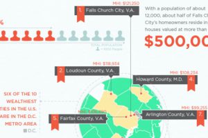
The richest counties in America by median income are not located near Silicon Valley or adjacent to Wall Street. They are not in oil rich Texas either. Read more
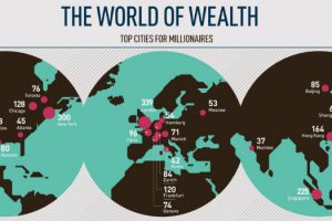
This infographic breaks down the top cities for millionaires sorted by density and total population, as well as providing demographics. Read more
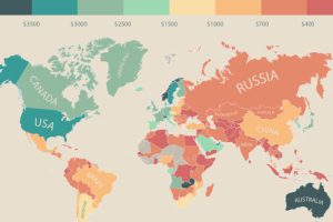
In this infographic, monthly disposable income around the world is mapped by state and country. Switzerland leads the pack with $6,301 in income per month. Read more

Who are the world’s wealthiest people in 2015? This infographic shows the trends as well as the top 10 billionaires, and how they amassed their fortunes. Read more
The cost of living by state and county varies significantly. Here’s how far $100 will go in every part of America. Read more
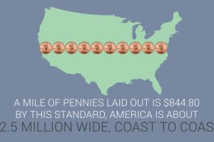
This infographic covers 33 little-known U.S. currency facts about the bills and coins in circulation today. Read more
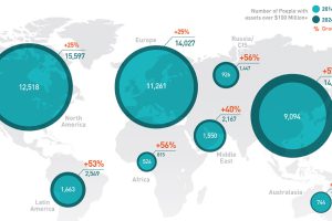
In the old days, speculators would follow the gold rushes. Now, it’s emerging markets that provide the big chance to become the next centimillionaire. Read more
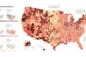
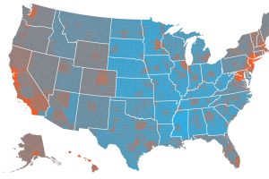
This map visualizes when the household median incomes of U.S. counties reached “peak income”. For more than 80% of counties, this was over 15 years ago. Read more