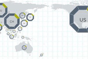
This interactive map uses 114 metrics to measure the geopolitical power and influence of 25 countries, focusing on Asian powers and the United States. Read more
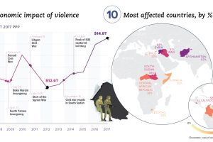
Aside from the obvious human toll, violence also hurts productivity and wealth creation. We visualize the real economic impact of violence in these charts. Read more
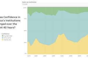
Americans rely on several institutions for their services and safety—but how has their confidence in institutions changed since 1975? Read more
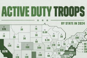
States with long coastlines tend to host the most active duty troops, with one exception, home to the services’ newest branch. Read more
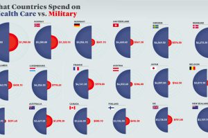
Every year, governments spend trillions on healthcare and defense. But how much is spent per person, and how does this compare by country? Read more
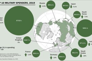
Global military spending surpassed $1.9 trillion in 2019, but nearly 75% of this total can be traced to just 10 countries. Read more
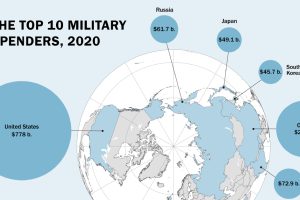
Global military spending is now at a 32-year high. We show countries’ military spending by dollars and as a portion of GDP. Read more
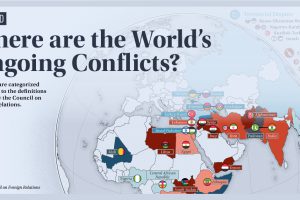
In 2021, we live in a time of relative peace, however, as this map reveals, that does not mean there are no conflicts in the world today. Read more
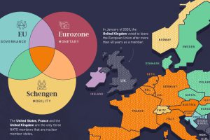
Europe’s member states are part of one or more of the four major treaty groups. Here we map the countries that are part of these groups. Read more


