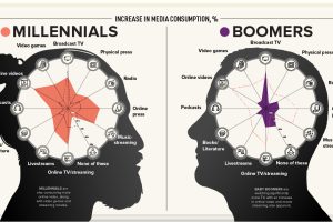
This visualization explores how each generation’s media consumption is changing amid the frenzy of pandemic-induced quarantines. Read more

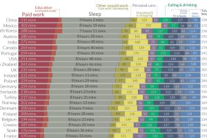
We all have the same 24 hours in the day. How do people spend them around the world, and how does this breakdown change by gender? Read more

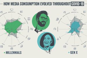
This infographic examines trends in each generation’s media consumption to see how Americans adapted during the pandemic. Read more

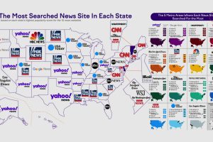
American states have some key differences for their favorite news sites. Here’s how they rank by monthly visitors and state popularity. Read more

Spotify’s ‘Billions Club’ playlist tracks every song with over 1 billion streams. We took the data and broke it down by decade and artist. Read more

