

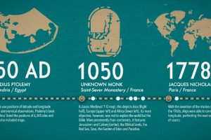
What did ancient maps look like, before we had access to airplanes and satellites? See the evolution of the world map in this nifty infographic. Read more
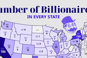
Just four states—California, New York, Florida, and Texas—account for more than 60% of all U.S. billionaires. Read more
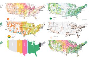
The U.S. covers an immense 3.8 million square miles—what is all this land currently used for, and what does that mean for the future? Read more
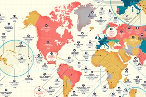
Which companies have stood the test of time? This detailed map highlights the oldest company in every country that is still in business. Read more
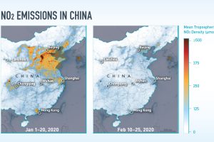
While the COVID-19 pandemic has been all-consuming, these satellite images show its unintended environmental impacts on NO₂ emissions. Read more
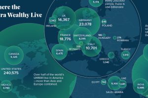
Here’s where the world’s ultra-rich (>$30 million in assets) live, and also how the landscape is projected to change over the coming years. Read more
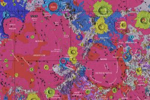
Behold the glory of the Unified Geologic Map of the Moon, which brings decades of data into one map, revealing the potential for exploration. Read more
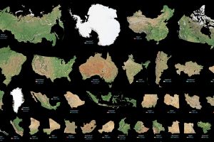
Maps can distort the size and shape of countries. This visualization puts the true size of land masses together from biggest to smallest. Read more
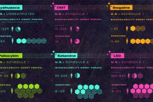
This infographic provides a simple overview of the seven most common psychedelic substances and explores their therapeutic potential. Read more
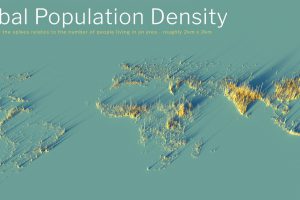
What does population density look like on a global scale? These detailed 3D renders illustrate our biggest urban areas and highlight population trends. Read more