

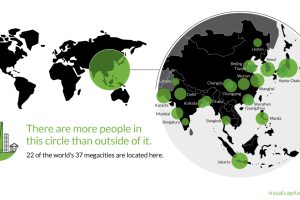
That’s right – nearly 4 billion people live inside the circle on this world map, including 22 of the world’s 37 megacities. Read more
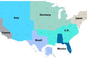
The United States has a $18 trillion economy – the biggest in the world. But here’s another way of looking at it, using three interesting maps. Read more
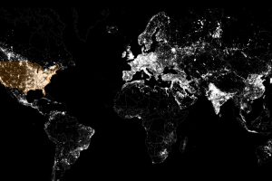
These satellite maps visualize where different energy sources, like fossil fuels, nuclear, or renewables, are used to generate electricity. Read more
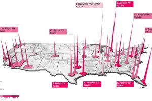
Women-owned businesses make up an increasing percentage of the American economy. Here are some of the cities where these businesses are being added the fastest. Read more
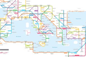
Navigating the mean streets of 125 AD just got a lot easier with this subway-style map of the ancient Roman road network. Read more
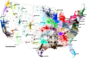
A massive commuter dataset and algorithmic approach have created a unique, new map of America’s megaregions. Read more
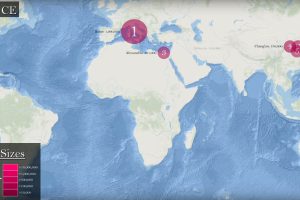
See how the list of the world’s five largest cities has changed between 3000 BC until today, and how it’s expected to shift as we close out the 21st century. Read more
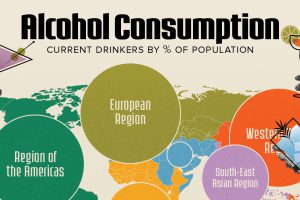
European countries have the highest percentage of alcohol drinkers. Read more
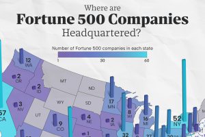
This map shows the number of Fortune 500 companies headquartered in each state. Which states have the highest concentration of large firms? Read more
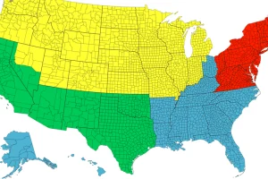
Each of the four colors is equal to 25% of the country’s total population – and things get interesting when looking at Canada, Chile, or California. Read more