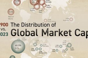
We breakdown the world’s largest stock markets by country, highlighting the massive growth of the U.S. and Asia. Read more

People in Latin American and Southeast Asian countries had the most positive emotions, like feeling joy or smiling and laughing a lot. Read more

People in African and Middle Eastern countries had the most negative emotions like feeling angry, sad, or stressed. Read more
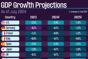
We summarize the latest GDP growth projections from the IMF, covering select economies from the developed and developing world. Read more
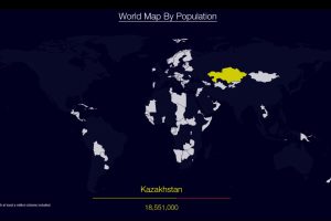
Watch countries appear one-by-one to form a cohesive world map, when they are ordered by population. Read more
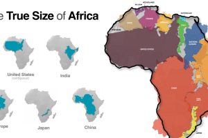
Common map projections warp our view of the globe. This graphic reveals the true size of Africa, which could fit the U.S., China, India, and more. Read more

For 30 years, the Hubble Space telescope has been our eye into outer space. This stunning map looks at 550,000 observations made between 1990-2019. Read more
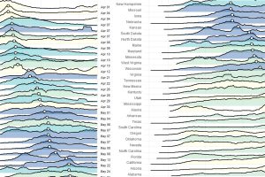
These charts and maps show the evolution of COVID-19’s spread in the United States, by organizing data based on peak case and death dates. Read more
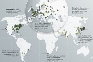
Which countries are turning to nuclear energy, and which are turning away? Mapping and breaking down the world’s nuclear reactor landscape. Read more
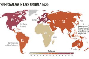
The world’s population is aging, but not at the same rate. This animated map visualizes the changes in median age in every region since 1950. Read more

