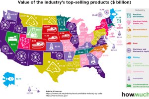
Which industries reign supreme in the United States? This map breaks down the most profitable industry, state by state. Read more
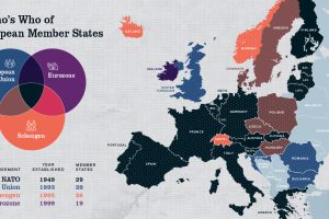
Europe has members in at least four major treaty groups. This map shows how these groups fit into the big picture of Europe’s member states. Read more
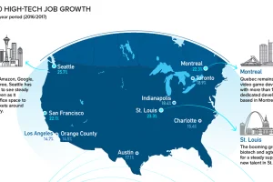
Silicon Valley is no longer the only place to be for a career in tech. Here are the fastest growing tech markets across North America, and the up-and-comers. Read more
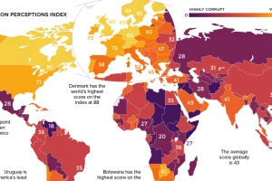
Which countries are the most (and least) corrupt? This world map shows the figures for the Corruption Perceptions Index (CPI) for 2018. Read more
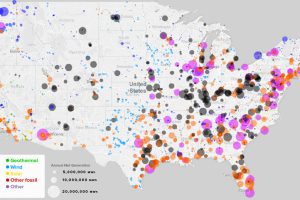
What sources of power are closest to you, and how has this mix changed over the last 10 years? See every power plant in the U.S. on this handy map. Read more

This animation shows the population density of U.S. counties between 1790 and 2010, showing the westward expansion of the country’s population. Read more
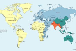
This simple map visualization will change how you think about global population, and how people are distributed throughout the planet. Read more
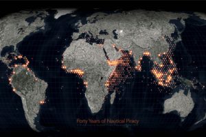
Ever since humans first sailed the high seas, piracy has been a dangerous risk. See instances of modern piracy on this detailed map. Read more
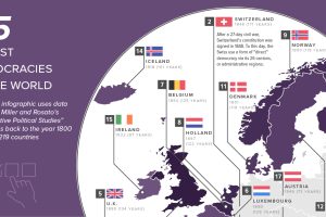
This map shows the 25 oldest democracies in the world, based on how long current democratic governments have been in continuous power. Read more

This epic attempt to condense the history of the world — including the rise and fall of empires — fits into a single video. Read more

