

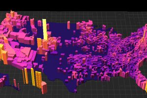
What are the most expensive U.S. housing markets? This interactive 3D map looks at county-level data by price per square foot to provide an answer. Read more
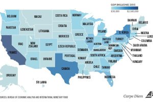
Texas is the size of Canada, and California is similar to France. Even tiny Vermont is comparable to a country’s GDP (Bahrain). Read more
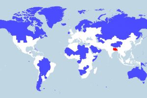
More people live in the tiny red region than all of the blue areas combined. This map really shows the disparity in population density throughout the globe. Read more
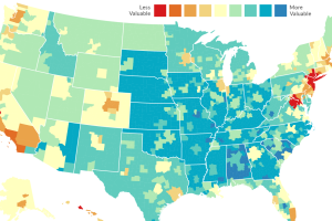
Every dollar spent is not equal. In some cities like NYC or SF, it will buy you far less – and in other places, a dollar has much more buying… Read more
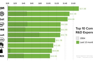
Who spends the most money on research and development (R&D)? We look at the data on an international level, as well as the companies focused most on innovation. Read more
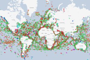
We show you a website that tracks every ship in real-time, and use it to highlight the world’s oil chokepoints, the coast of Somalia, and other observations. Read more
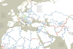
This detailed and incredible map shows the exact date of origin for every one of the world’s international borders. Read more
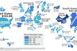
Amazon edged out Google and Apple to become the most valuable brand in the U.S. – and by far the most dominant brand globally. Read more
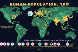
This animation captures 200,000 years of human population growth – see everything from the invention of farming to the impact of the Black Death. Read more
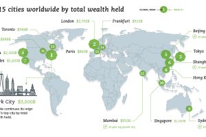
What are the world’s wealthiest cities, and what portion of global wealth is located in each of these key urban centers? Read more