

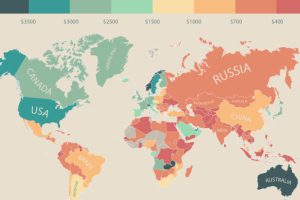
In this infographic, monthly disposable income around the world is mapped by state and country. Switzerland leads the pack with $6,301 in income per month. Read more

The Quality of Life Index is made using seven factors: safety, healthcare, consumer prices, purchasing power, traffic commute, pollution, and property price to income ratio. Read more
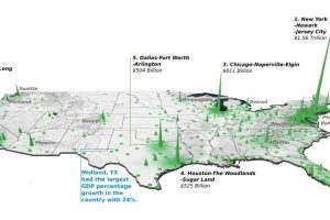
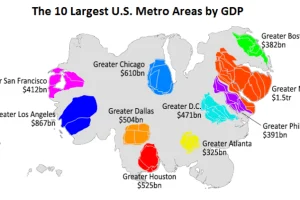
Did you know that the Top 20 metropolitan areas in the U.S. contribute 52% of the total country’s GDP? See how it breaks down by city in this 3d map. Read more
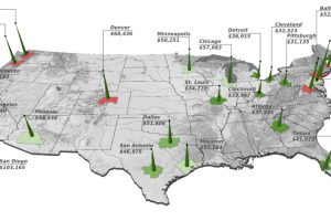
This animation uses county-level GDP data to re-size a U.S. map based on the economic contributions at a local level. Read more
How much do you need to make to buy a home in different cities across the country? Here’s the salary needed to buy a home in 27 major U.S. cities. Read more
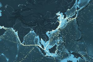
How busy are the world’s shipping routes, and where are the global chokepoints for commercial shipping? See every ship’s movement on this interactive map. Read more
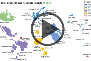
As the United States strives towards energy independence, watch how oil imports have dramatically shifted from the Middle East to a new oil source. Read more
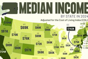
This graphic shows median income by state in 2024, adjusted for cost of living. Can you guess where it’s the highest? Read more
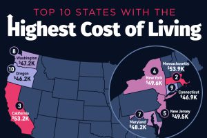
Hawaii secured the top spot as the U.S. state with the highest cost of living, with an average annual expenditure of $55,491. Read more
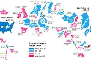
What is a top brand worth? This infographic highlights the most valuable brand in each country, according to the 2017 Brand Finance report. Read more