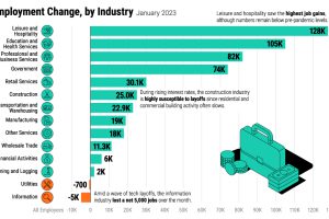
The U.S. labor market is remarkably strong, with a 3.4% unemployment rate. Which sectors are seeing the highest job gains in 2023? Read more

According to employee reviews on Glassdoor, here’s how the ranking of top-rated employers in the U.S. has changed over the last five years Read more
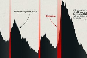
This infographic examines 50 years of data to highlight a clear visual trend: recessions are preceded by a cyclical low in unemployment. Read more
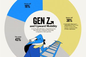
Despite the looming uncertainty, members of Gen Z maintains an optimistic outlook about their financial future Read more
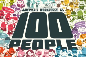
Reimagining all 200 million of the American workforce as 100 people: where do they all work, what positions they hold, and what jobs they do? Read more
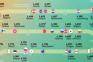
Where do people work the most? Explore our analysis of the average annual working hours across OECD countries. Read more
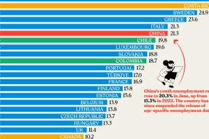
Nearly three years after COVID-19 first hit, youth unemployment in some countries, like China, has risen sharply. Read more
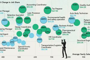
Some jobs need a degree, while others don’t. Here are the top 20 most sought-after entry level jobs with and without a degree. Read more
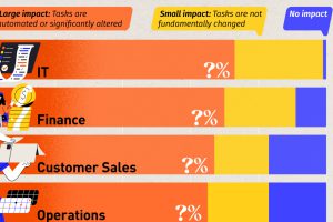
We visualized the results of an analysis by the World Economic Forum, which uncovered the jobs most impacted by AI. Read more


