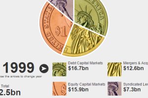
This interactive finance infographic shows the evolution of investment bank fees from 1996 until today. Read more

How busy are the world’s shipping routes, and where are the global chokepoints for commercial shipping? See every ship’s movement on this interactive map. Read more

Take a journey into the future in this interactive infographic to see what kind of bizarre technologies your next home may have to offer. Read more

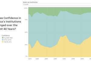
Americans rely on several institutions for their services and safety—but how has their confidence in institutions changed since 1975? Read more

Which countries are the world’s biggest alcohol drinkers? This interactive map explores global alcohol consumption per capita. Read more

