What countries have the highest real interest rates? We look at 40 economies to analyze nominal and real rates after projected inflation. Read more
Global house prices were resilient in 2022, rising 6%. We compare nominal and real price growth by country as interest rates surged. Read more
Home price growth has moderated amid rising interest rates and a narrow housing supply. Here’s how prices compare to historical trends. Read more
This graphic shows what it takes to be wealthy in America today—and how this can significantly shift based on the city you live in. Read more

The world’s millionaire population has more than doubled in the last decade between 2012 and 2022. We visualize these numbers here. Read more

In this graphic, we take a look at the recent U.S. mortgage rate surge, and how the 30-year fixed-rate mortgage has evolved since 2013. Read more
Here’s how investor sentiment has shifted over the last three decades, from the Dotcom boom to present-day. Read more
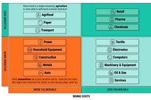
We show the sectors with the lowest exposure to recession risk—and the factors that drive their performance. Read more

What are Gen Z’s favorite brands? Here are the top 5 brands for apparel, footwear, and handbags, according to U.S. teens in September 2023. Read more

As top institutions advise for cautious deployment of capital next year, what assets and strategies are in their investing playbook in 2024? Read more

