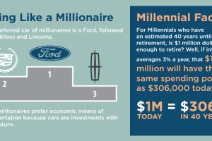
The preferred car for millionaires is a Ford, and most millionaires expect to continue working all the way until retirement. Read more
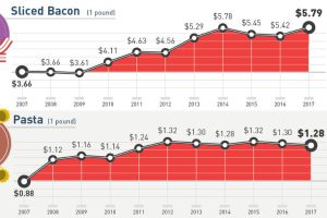
How much more expensive are basic staples than they were 10 years ago? This infographic tracks grocery prices for 30 common items like cheese, fruit, and eggs. Read more

Even fast food restaurants have seen their prices surge this past decade. Which ones lead in terms of fast food inflation? Read more
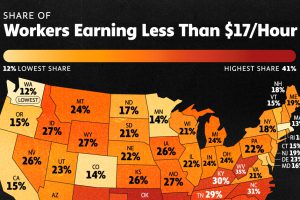
Today, 30.6 million Americans are low-wage workers. In this graphic, we show the share of the workforce earning under $17 an hour, by state. Read more
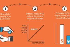
Why do the exchange rates between currencies fluctuate? This infographic looks at six major factors that drive these movements. Read more
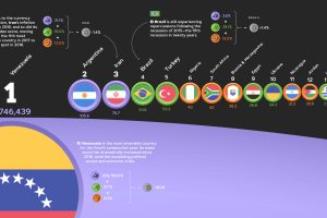
The annual Misery Index ranks the most and least miserable countries, based on four economic factors—unemployment, inflation, lending rates, and GDP growth. Read more
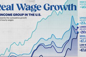
Since 2019, low-paid workers’ real income spiked more than the last 40 years combined. Here are real wages over time, by income group. Read more
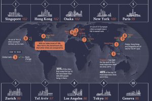
From Osaka to New York, we look at a global ranking of the 10 most expensive cities, and how those rankings have changed over the last year. Read more


