

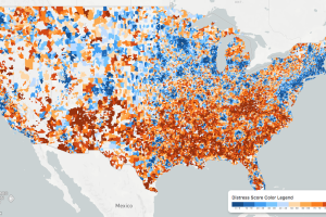
While the U.S. economic picture remains quite rosy, things change quickly when you zoom to the local level. This map shows the country’s distressed communities. Read more
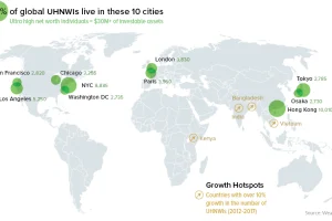
A data-driven snapshot of global wealth distribution. The average person around the world is doing better, but big-picture inequality is still staggering. Read more
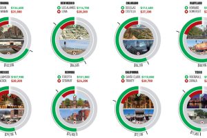
This infographic uses the measure of median household income to contrast the wealthiest and poorest counties in every U.S. state. Read more
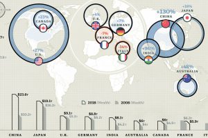
These countries hold 74% of the world’s $204 trillion in private wealth. See the 10 richest countries, and how their totals have changed over time. Read more
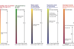
This visualization shows the global inequality gap — a difference in the standards of living around the world, as well as how it’s changed over 200 years. Read more
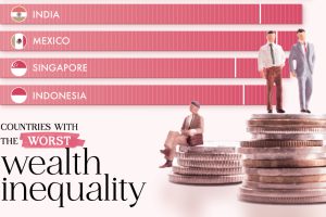
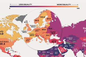
South Africa recorded the highest wealth inequality in 2023, as measured by the Gini index. Which other countries made the top 10? Read more
In recent years, many economies have made women’s rights a priority, yet only 10 countries in the world offer full legal protections to women. Read more
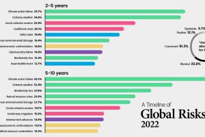
Which risks are top of mind in 2022? We visualize the World Economic Forum’s global risk assessment for top risks by impact and livelihood. Read more
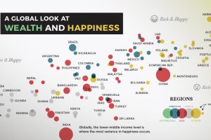
Can money really buy happiness? In this chart, we compare most of the world’s countries to examine the relationship between wealth and happiness. Read more
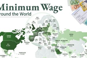
This infographic shows the net minimum wage across 67 countries, as of January 2023. A breakdown by U.S. state is also included. Read more