

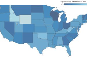
This interactive infographic shows how America’s middle class has changed since 2000. Median income and % spent on housing also has changed significantly. Read more
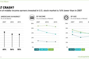
Polls show that fewer Americans are in the stock market than in the last two decades. The biggest casualties have been lower and middle income earners. Read more
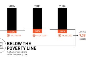
Is there really a recovery? Most recent data shows that there are 9.4 million more Americans in poverty than 2007, with growing inequality. Read more
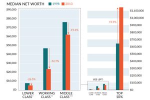
It’s clear to many Americans that the ‘system’ isn’t working for most people, and this chart sums up the wealth inequality problem perfectly. Read more
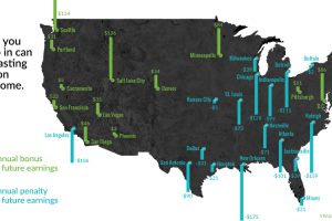
Family and neighborhoods influence a child’s development and opportunities – and as a result, future incomes. See which cities have the biggest impact. Read more
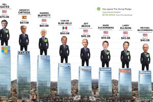
Eight men have the same wealth as the poorest 50% – we use the Oxfam report as a springboard to dive into a discussion on inequality, philanthropy, and poverty. Read more
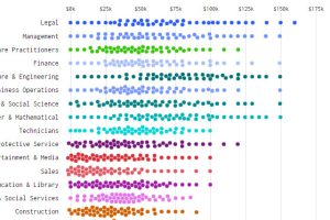
What does income distribution look like for different types of jobs – and how’s it changed over time? These charts show the drastic change from 1960 to today. Read more
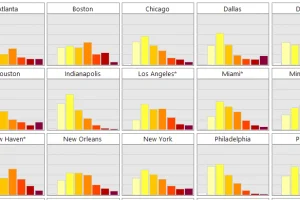
The middle class now makes up less than half of the population in the U.S. – see its decline simultaneously across 20 major cities in this simple animation. Read more
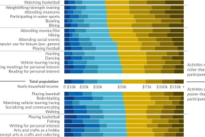
Ever wonder how people spend time? This data visualization shows favorite American past-times like playing baseball or watching TV by using income brackets. Read more
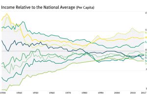
For most of the century, the geographical difference in per capita incomes has been narrowing – but it appears this trend has now reversed in the U.S. Read more