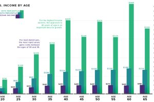
What is the relationship between age and income level? We visualize the data and compare it to commonly held beliefs on the topic. Read more
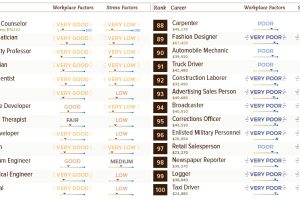
Not all jobs are created equal – see this list of 100 common careers ranked based on income, stress levels, growth potential, and other factors. Read more
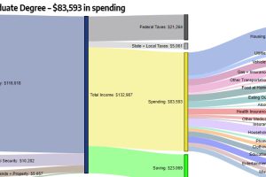
How do different types of education (high school, bachelor’s degree, etc.) correspond to level of income and household expenditures? Read more
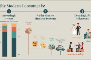
We all have a stereotypical image of the average consumer – but is it an accurate one? Meet the modern consumer, and what it means for business. Read more
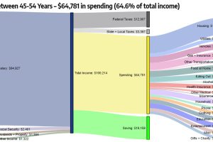
These interesting diagrams break down how Americans of different age groups earn and spend their money, and what the money goes towards. Read more
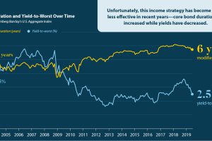
Traditional longer-terms bonds are no longer as effective—so which additional income strategies should investors be considering? Read more
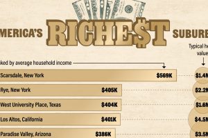
This graphic ranks the top 10 wealthiest suburbs in America, seeing the most entries from California, Texas, and New York. Read more

Amid the pandemic, the idea of Universal Basic Income has been gaining steam with policymakers. Where has it been tried, and has it worked? Read more
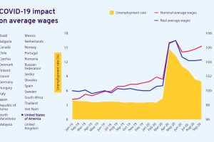
The pandemic has impacted labor in many ways. Here’s how global wages and unemployment have been affected by COVID-19 in 30 countries. Read more
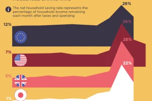
Were people more frugal during the pandemic or did they break the bank? This visual assesses the saving rates across different countries. Read more

