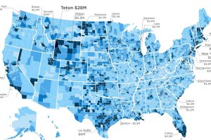
To make it into the Top 1% of US earners, you must make $521k. However, avg income of the 1% varies wildly at a county level, ranging from $127k to… Read more
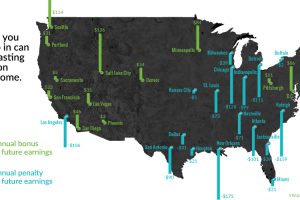
Family and neighborhoods influence a child’s development and opportunities – and as a result, future incomes. See which cities have the biggest impact. Read more
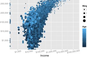
Does making a lot of money translate to actual net worth? We look at the data, and the link (or lack thereof) between income and wealth is surprising. Read more
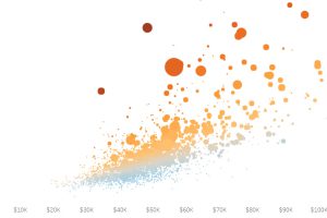
It’s no surprise that New York and San Francisco are insanely expensive, but here’s some other enclaves that have the least affordable housing in the U.S. Read more
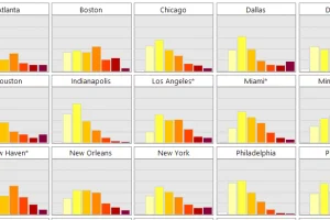
The middle class now makes up less than half of the population in the U.S. – see its decline simultaneously across 20 major cities in this simple animation. Read more
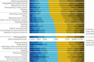
Ever wonder how people spend time? This data visualization shows favorite American past-times like playing baseball or watching TV by using income brackets. Read more
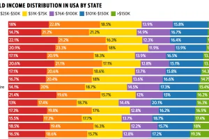
This colorful data visualization breaks down the household income of each U.S. state into six income brackets. Read more
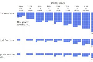
Visualizing how different income groups spend their money on things like housing, food, transportation, health, and travel. Read more

We round up the most popular, most discussed, and most liked visualizations of the month on Voronoi, our new data storytelling platform. Read more
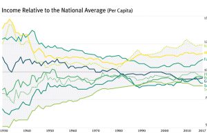
For most of the century, the geographical difference in per capita incomes has been narrowing – but it appears this trend has now reversed in the U.S. Read more

