
Tax burden measures the percent of an individual’s income that is paid towards taxes. See where it’s the highest by state in this graphic. Read more

Families in expensive states require over $270,000 annually to live comfortably. Read more
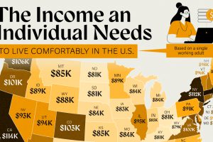
A single adult needs to make at least $116k annually to live comfortably in Massachusetts. Read more
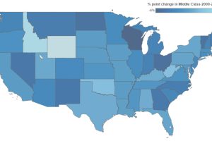
This interactive infographic shows how America’s middle class has changed since 2000. Median income and % spent on housing also has changed significantly. Read more
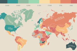
In this infographic, monthly disposable income around the world is mapped by state and country. Switzerland leads the pack with $6,301 in income per month. Read more
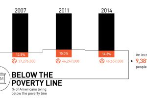
Is there really a recovery? Most recent data shows that there are 9.4 million more Americans in poverty than 2007, with growing inequality. Read more
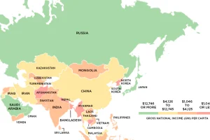
This series of maps uses data on Gross National Income (GNI) to classify the world’s richest and poorest countries based on four income groups. Read more
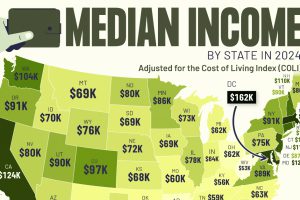
This graphic shows median income by state in 2024, adjusted for cost of living. Can you guess where it’s the highest? Read more
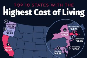
Hawaii secured the top spot as the U.S. state with the highest cost of living, with an average annual expenditure of $55,491. Read more
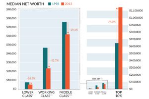
It’s clear to many Americans that the ‘system’ isn’t working for most people, and this chart sums up the wealth inequality problem perfectly. Read more

