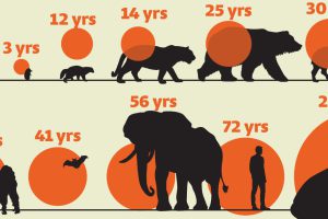
While smaller animals such as weasels typically live 1-2 years, larger counterparts can thrive for decades. Read more
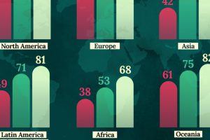
This map shows life expectancy at birth for key global regions, from 1950 to 2050F. Read more

Dogs may be our best friends, but as a carrier of the rabies virus, they end up fourth on the list of top 10 deadliest animals. Read more

Despite only being around for thousands of years, human technological progress has been pretty incredible. See the history of technology in this infographic. Read more
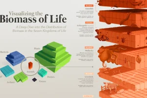
Our planet supports nearly 8.7 million species. We break down the total composition of the living world in terms of its biomass. Read more

The amount of human-made (or anthropogenic) mass, has now exceeded the weight of all life on Earth, including humans, animals, and plants. Read more
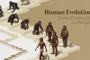
From single cells to bipedalism, humans have come a long way. Explore the fascinating journey of human evolution in this infographic. Read more

This list excludes humans, who would otherwise lead the ranks of most common primates by a significant margin. Read more

