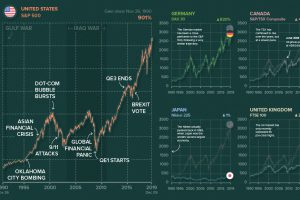
Ever wonder what other major stock markets would look like, if they were on the same scale of the S&P 500? We chart them all over a 30-year period. Read more
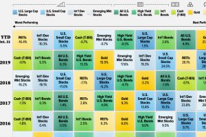
What are the best-performing investments in 2020, and how do previous years compare? This graphic shows historical returns by asset class. Read more
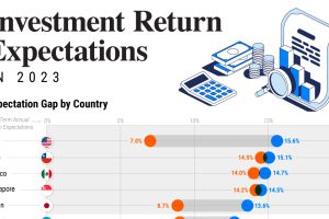
This graphic shows the gap in portfolio return expectations between investors and advisors around the world, revealing a range of market outlooks. Read more
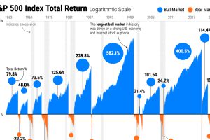
Stock market cycles often rhyme throughout history, shaped by monetary policy, consumer spending, and herd behavior. Read more
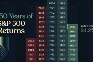
Last year, U.S. stocks took investors by surprise. This graphic shows S&P 500 historical returns since 1875 to put 2023 returns into context. Read more
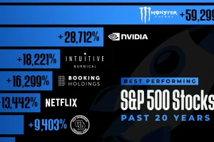
Which S&P 500 stocks have seen the highest returns over the last two decades? This graphic shows the top 15 performers. Read more
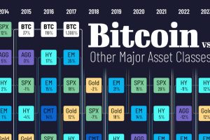
Bitcoin returns surged 156% in 2023, marking the end of the crypto winter. Here’s how its performance compared to major asset classes. Read more

