Here, we break down how people around the world get their protein intake. Read more

Part of the Mining Builds British Columbia series presented by the Mining Association of BC. About Mining Builds British Columbia Everything used by British Columbians in their everyday lives is… Read more

In June 2022, the U.S. Supreme Court overturned Roe v. Wade, opening the door for states to make their own decisions regarding abortion legality. How did states react? Read more
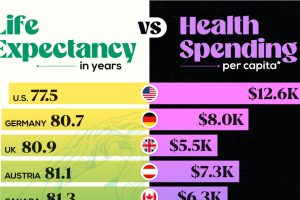
America’s per capita health spend is now past $12,500, but for what gains? A quick comparison with its peers. Read more
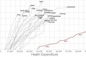
Americans spent more than $3 trillion, or 17.5% of GDP, on healthcare in 2015. Are they getting any bang for their buck? Read more
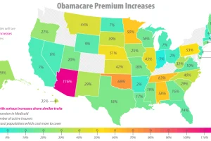
The future of Obamacare is uncertain, to say the least. See the major issues that have surfaced, including the skyrocketing premiums, in this infographic. Read more
Tech is breaking down barriers to entry as the world’s healthcare demands continue to grow. Here’s how to capitalize on this industry’s period of flux. Read more
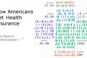
Here’s how Americans get healthcare coverage, using visualizations to show the numbers both nationally and for each individual state. Read more
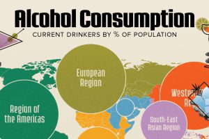
European countries have the highest percentage of alcohol drinkers. Read more
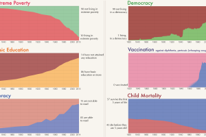
Long-term trends really allow you to see human progress on the most important indicators, like poverty reduction, education, democracy, literacy, and health. Read more

