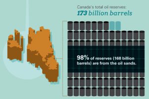
Infographic: How Big Are Canada’s Oil Sands? There’s no shortage of discussion on Canada’s oil sands. Even Leonardo Dicaprio has recently toured them while subsequently providing commentary that ruffled the… Read more
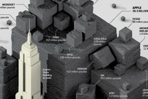
Visualizing the CO2 emissions saved by 56 of the Fortune 100 companies, expressed using the quantity of coal not burned. Read more

According to the largest ever meta-analysis of food systems, the carbon footprint of different types of food in your diet can vary widely. Read more
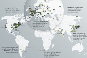
Which countries are turning to nuclear energy, and which are turning away? Mapping and breaking down the world’s nuclear reactor landscape. Read more
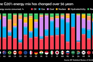
Watch how the energy mix of G20 countries has evolved over the last 50+ years. Read more
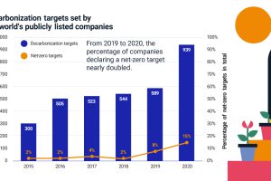
More companies are declaring net-zero emissions targets, but where can they start? Find out the steps companies and investors can take. Read more
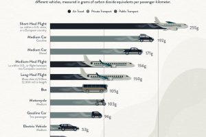
What’s the lowest-carbon way to travel? Here’s how much CO2 different types of vehicles emit per passenger-kilometer. Read more
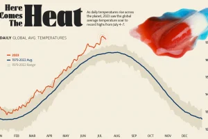
Four days straight in July 2023 set or equaled global temperature records on average. Read more
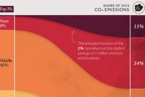
We visualize global CO2 emissions by income group, showing the impact of different wealth brackets on carbon generation. Read more


