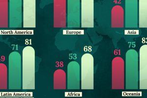
This map shows life expectancy at birth for key global regions, from 1950 to 2050F. Read more

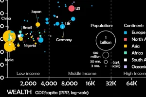
This unique animated visualization uses health and wealth measurements to chart the evolution of countries over time. Read more

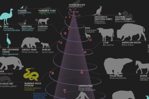
Human life expectancy is more than twice as long as it was in the 19th century. How do our lifespans rank compared to 49 other animals? Read more

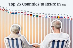
Which countries are the best equipped to support their aging population? This graphic show the best countries to retire in around the world. Read more

