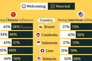
A significant share of respondents from an ASEAN-focused survey are not happy about rising American and Chinese influence in the region. Read more
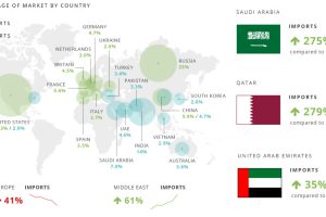
The global arms trade is huge. Estimated to be at least $76 billion in 2013, here’s who is trading arms to who. Read more
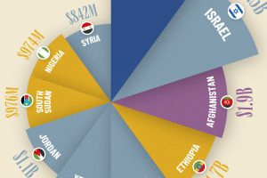
See which countries received the most U.S. foreign aid in fiscal year 2022, based on the latest official numbers. Read more
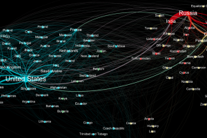
Who sends weapons to who? This data visualization represents the global weapons trade between countries, and it shines a light on two major blocs of trade. Read more
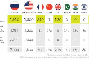
Where are the world’s nuclear weapons located, how have these totals changed, and what the heck is going on with North Korea right now? Read more
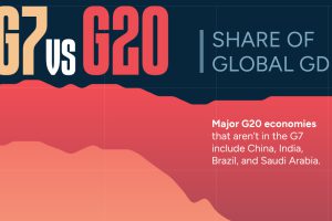
The G7’s share of global GDP has been shrinking since the early 2000s. See the full story in this infographic. Read more
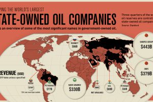
State-owned oil companies control roughly three-quarters of global oil supply. See how these companies compare in this infographic. Read more
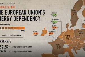
The EU’s energy dependency has become a major issue amid Russia’s invasion of Ukraine. See what the data says in this infographic. Read more

Russia faces a multitude of U.S. sanctions for its participation in global conflicts. This infographic lists who and what has been impacted. Read more
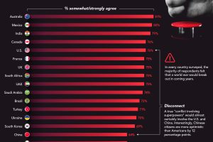
In every single country surveyed, the majority of respondents believed a global conflict would break out between superpowers in coming years Read more

