

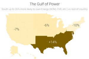
Recent data shows that investment portfolios are strongly biased to certain sectors based on where investors live. Read more
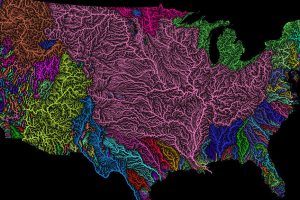
Nothing is more fundamental to life than water – so see the world’s watersheds like never before with these colorful and absolutely stunning maps. Read more
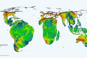
This cartogram animation shows the cycle of nature’s productivity – which resembles a rhythmic heartbeat over the course of a year. Read more
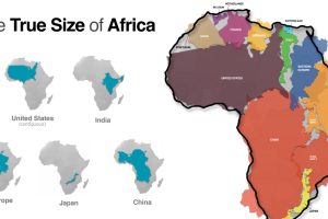
Common map projections warp our view of the globe. This graphic reveals the true size of Africa, which could fit the U.S., China, India, and more. Read more
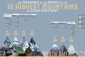
Mountains have inspired humans for centuries. But while Everest and Kilimanjaro might ring a bell, do you know the true meanings behind their names? Read more
We’ve come a long way since Pangea. This short video examines the area, population, and GDP of our continents as a share of the world’s total. Read more
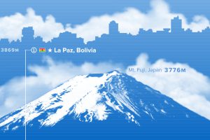
Where are the world’s highest cities? This graphic ranks the world’s major urban centers by altitude above sea level. Read more
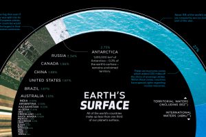
There are 510 million km² of area on the Earth, but less than 30% of this is land. Here’s the share countries make up of the Earth’s surface. Read more
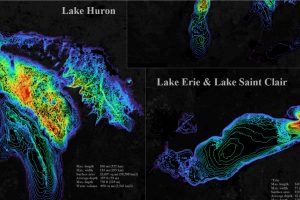
The five Great Lakes account for 21% of the world’s total freshwater. This bathymetric visualization dives into just how deep they are. Read more
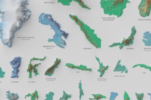
See the world’s 100 biggest islands in a side-by-side comparison. Then, we look to see which islands have the highest population densities. Read more