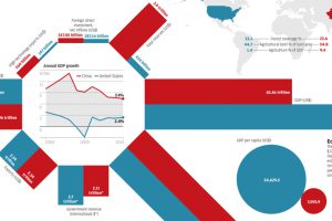
Today’s infographic looks at the economic differences between China and the United States: total reserves, GDP per capita, demographics, and much more. Read more
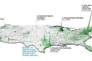
Did you know that the Top 20 metropolitan areas in the U.S. contribute 52% of the total country’s GDP? See how it breaks down by city in this 3d map. Read more
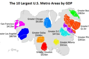
This animation uses county-level GDP data to re-size a U.S. map based on the economic contributions at a local level. Read more
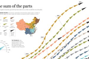
China’s economic miracle over the last 20 years is the sum of its parts, with each region of the country contributing to growth in different ways. Read more

The global economic climate finally has composure, according to asset management firm Schroders. It may be the calm before the storm, though. Read more

The U.S. has more millionaires than Ireland has people. Here’s a list of other countries with the most millionaires. Read more
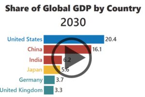
The rise of Asia has been swift. Here’s three GIFs that show the speed of China in becoming an economic power house – and how India is hot on their… Read more
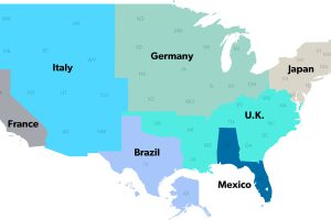
The United States has a $18 trillion economy – the biggest in the world. But here’s another way of looking at it, using three interesting maps. Read more
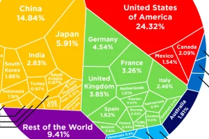
See how the multi-trillion dollar pie of the global economy gets divided between countries, based on the latest data from the World Bank from February 2017. Read more
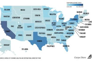
Texas is the size of Canada, and California is similar to France. Even tiny Vermont is comparable to a country’s GDP (Bahrain). Read more

