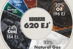
This graphic shows the sources of energy used globally in 2023, measured in exajoules, with fossil fuels making up 81% of the energy mix. Read more
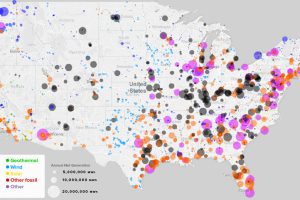
What sources of power are closest to you, and how has this mix changed over the last 10 years? See every power plant in the U.S. on this handy map. Read more
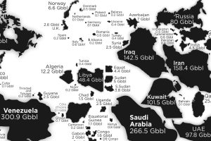
See the countries with the most oil reserves on this map, which resizes each country based on how many barrels of oil are contained in its borders. Read more
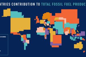
These four animated cartograms show the nations leading the world in fossil fuel production, in terms of oil, gas, coal, and total hydrocarbons. Read more
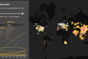
Today’s interactive map shows all of the world’s coal power plants, plotted by capacity and carbon emissions from 2000 until 2018. Read more
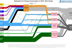
This incredible flow diagram shows how U.S. energy use broke down in 2019, including by source and end sector. Read more
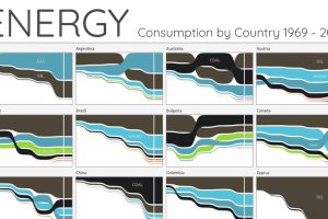
For the last 50 years, fossil fuels have dominated energy consumption. This chart looks at how the energy mix is changing in over 60+ countries. Read more
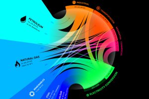
From renewables to fossil fuels, we’ve visualized the diverse mix of energy sources that powered U.S. energy consumption in 2020. Read more

Oil still makes up the largest share of the global energy mix. Here are the largest oil and gas companies by market cap in 2021. Read more
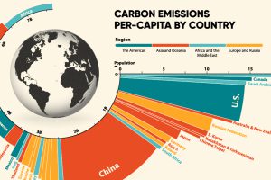
33.6 Gt of CO2 was emitted across the world in 2019. Here we visualize the global per capita CO2 emissions by country and region. Read more

