

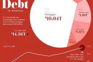
Since 2003, U.S. household debt has doubled to over $14.5 trillion. We break down the components of this colossal figure. Read more
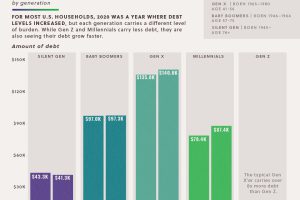
The majority of U.S. households saw debts rise in 2020. This data looks at the growth in household debt and the existing debt pile, by generation Read more
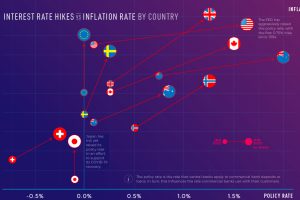
Inflation rates are reaching multi-decade highs in some countries. How aggressive have central banks been with interest rate hikes? Read more
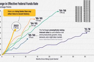
The effective federal funds rate has risen more than two percentage points in six months. How does this compare to other interest rate hikes? Read more
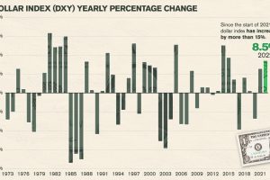
In a volatile and difficult year for many assets and equities, how have the world’s major currencies performed against the U.S. dollar? Read more
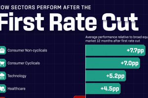
The market expects the Fed to make its first interest rate cut in September, but how could this impact different sectors of the economy? Read more
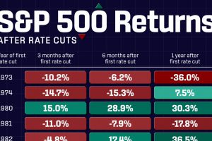
In the past 50 years, S&P 500 returns following interest rate cuts have varied widely, from +36.5% to -36% a year later. Read more
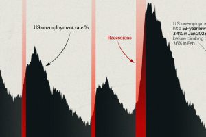
This infographic examines 50 years of data to highlight a clear visual trend: recessions are preceded by a cyclical low in unemployment. Read more
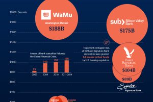
This graphic charts over 560 U.S. bank failures since 2001, including the most recent addition: First Republic Bank. Read more
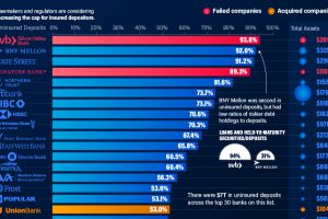
Uninsured deposits in the U.S. total at least $7 trillion. We show the top 30 banks with the highest level of these deposits. Read more