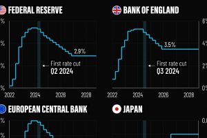
In this graphic, we show the IMF’s interest rate forecast for the U.S., Europe, the UK, and Japan for the next five years ahead. Read more
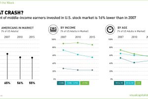
Polls show that fewer Americans are in the stock market than in the last two decades. The biggest casualties have been lower and middle income earners. Read more
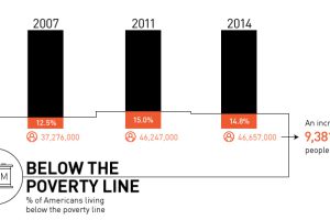
Is there really a recovery? Most recent data shows that there are 9.4 million more Americans in poverty than 2007, with growing inequality. Read more

Today, the majority of institutions are forecasting one or two interest rate cuts in 2024, a notable decline from earlier projections. Read more
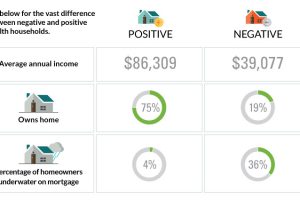
The differences between America’s poorest homes – those with negative wealth – and their positive counterparts are stark and numerous. Read more

Markets are complex systems – and there is mounting evidence that they have reached a critical state. See how and why the next ‘avalanche’ could be triggered. Read more
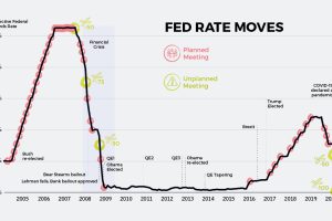
As interest rates continue their historic spiral downwards, the world’s central banks are running out of conventional tools to settle markets. Read more
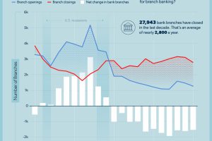
Over the last decade, U.S. bank locations have closed down at an alarming rate. Are we nearing the end of branch banking? Read more
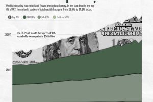
Over the past decade, the top 1% of U.S. households’ portion of wealth has gone from 28.6% to 31.2%. Read more


