

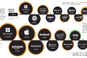
See how the world’s largest companies have changed over time, and how this helps tell a broader story about what the market is thinking. Read more
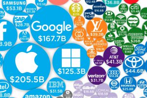
Technology brands account for 20 of the world’s 100 most valuable brands in 2019, combining for a whopping 43% of total brand value. Read more
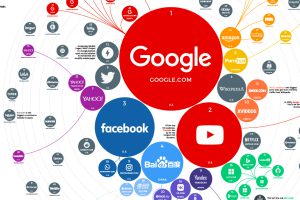
The top 100 websites ranking reveals how people around the world search for information, which services they use, and how they spend time online. Read more
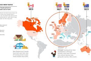
Which real estate markets have the highest risk of seeing a correction? These maps highlight housing bubble risks using data from four key indicators. Read more
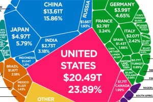
According to the latest World Bank data, the global economy is now $85.8 trillion in nominal terms. Here’s how it breaks down. Read more

A collection of the best Warren Buffett quotes, accompanied with illustrations, to close out our infographic series on the famous investor. Read more

Last year, the global banking industry cashed in an impressive $1.36 trillion in profits. Here’s where they made their money, and how it breaks down. Read more

Today’s stunning map ranks the world’s most powerful megaregions — together, they contribute a whopping $28 trillion to the global economy. Read more
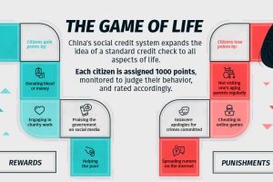
This infographic explores how China’s proposed social credit system will monitor and surveil citizens, and how it’ll be used to reward or punish them. Read more
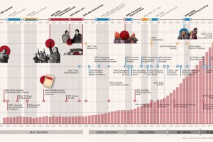
How did China go from agrarian economy to global superpower? This timeline covers the key events and policies that shaped the PRC over its 70-year history. Read more