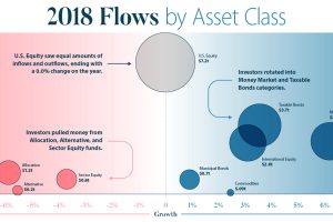
This infographic breaks down investment flows into funds (mutual funds, ETFs, etc.) over the course of 2018 to show how and when investors changed strategies. Read more
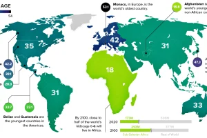
This chart takes a look at the median age of every continent, while also breaking down the youngest and oldest countries in the world. Read more
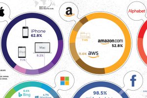
Collectively, the Big Five tech giants combine for revenues of $802 billion, which is bigger than Saudi Arabia’s economy. Here’s how it breaks down. Read more
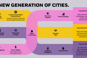
By 2050, there will be 2.5 billion more people living in cities than today. How is rapid urbanization set to impact investors and the global economy?v Read more
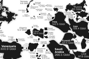
See the countries with the most oil reserves on this map, which resizes each country based on how many barrels of oil are contained in its borders. Read more
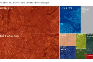
Global economics is effectively a numbers game – here are the countries and regions projected to contribute the most to global growth in 2019. Read more
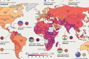
Where are the happiest, least happy, and fastest improving countries worldwide? We’ve broken down this annual ranking by region to answer that question. Read more

Freedom of speech on the internet has been on decline for eight consecutive years. We visualize the death spiral to show who limits speech the most. Read more

Banking talent is undergoing a fundamental shift. This infographic explores how banks are adapting to rapid automation and digitization in the industry. Read more
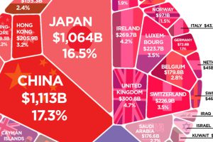
More than $6 trillion of U.S. debt is owned by foreign governments such as China or Japan. See how it all breaks down, and what it means. Read more

